It can be hard to see what has been posted as suggestions, or to see how popular.
Perhaps a vote up icon on the forum.
I se others have simialr request about UI changes.
1) Better touch/scroll for tablets/surface
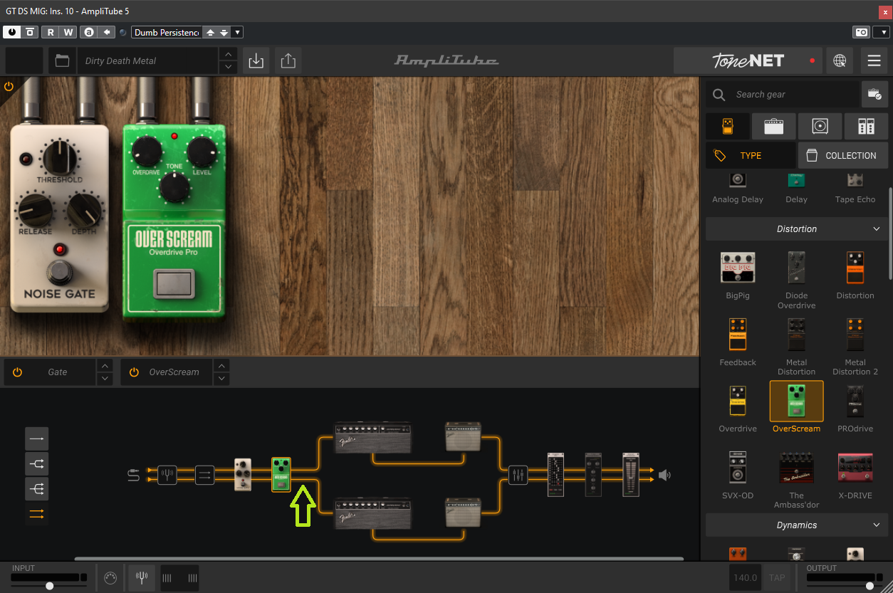
2) Hide panels not being used esp during performance. When playing really just want to control the pedals and presets, the rest is distraction.
3) Wider scroll bars.
I'd be very happy if that was done. Currently some real UI issues that make the software seems dated even though it is a new release. While I appreciate a lot of effort gone into the modelling technology, there should be the same care put into the UI/user experience.
Perhaps a road map so we can see if these ideas we post are being planned?
Thanks
